NestFundi
Helping immigrants and newcomers build wealth with ease and confidence.
What brought up the designing of Nestfundi was that immigrants face some challenges when trying to build financial stability in a new country. This could be caused by lack of financial literacy, access barriers to investment platforms, difficulty in maintaining consistent savings, etc. Nestfundi was designed as a digital companion application that helps immigrants and newcomers effortlessly save, invest, and manage their funds, regardless of background or prior experience. Nestfundi combines modern design, trust-building elements, and smart financial tools in one seamless application. This case study explores how I designed Nestfundi, a financial platform that feels safe, intuitive, and accessible to first-time users.
My Role
I was the lead UI/UX designer on this project, conducted user research, user interviews, brand identity and design of brand digital assets
Timeline
6 Weeks
First Iteration Prototype
Understanding The Problem
Moving to a new country is demanding, and financial confidence is always one of the biggest problems. Immigrants living abroad are finding it difficult to save and grow their money safely because traditional investment platforms feel intimidating, confusing, or even exclusive.
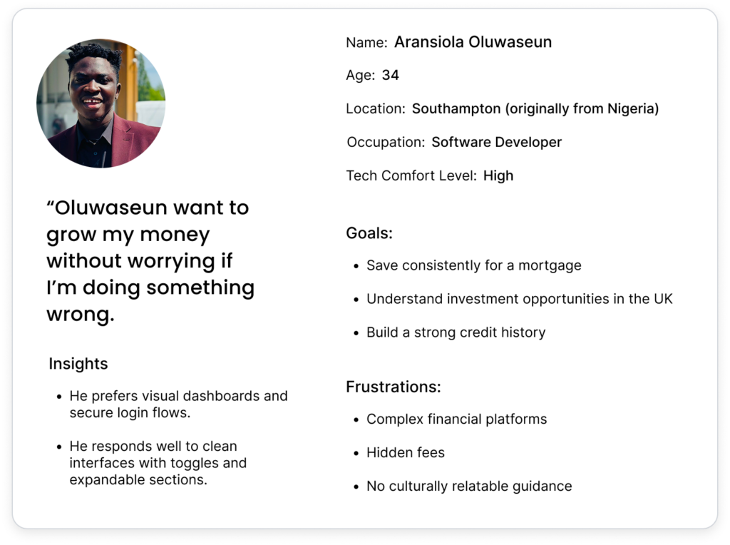
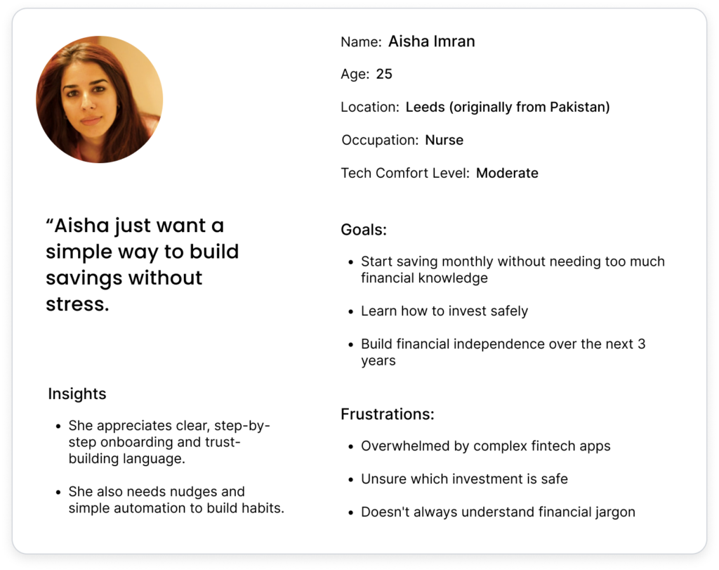
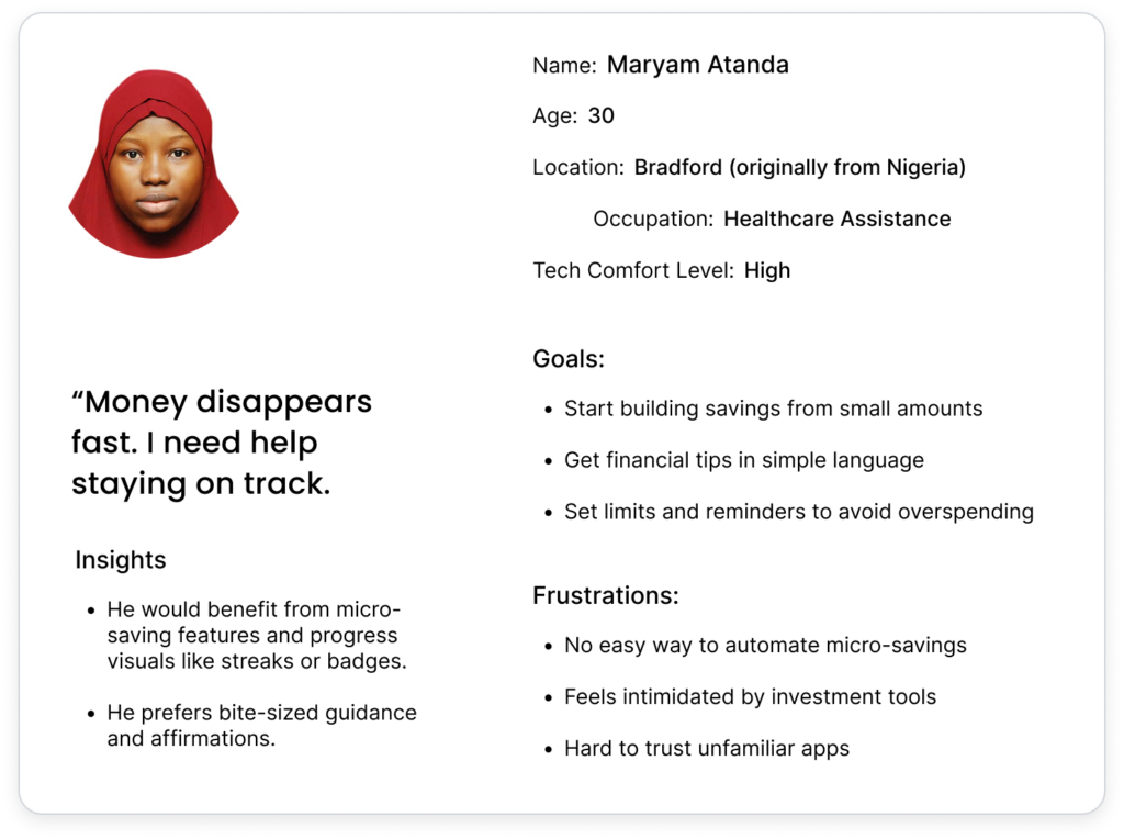
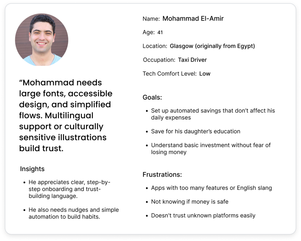
User Personas
I conducted 10+ interviews and surveys with immigrants especially from Nigeria, India, Pakistan, Eastern Europe etc.
The solution
Create a simple, clean, trustworthy, and modern investment platform that instills trust for first-time investors, allows easy navigation across multiple portfolios, and provides an intuitive way to personalize their savings and investment journeys.
Defining the Problem
How might I encourage immigrants to have the confidence they need to save and invest without overwhelming them?
From this statement, I generated three design principles to guide the experience:
- Clarity First: Every term and component of Nestfundi is intended to give users a sense of control. To guarantee that users of all backgrounds can comprehend their alternatives without requiring a financial background, all of the financial jargon used has been reduced into plain language. For example, CTA button texts are purposefully simple and straightforward.
- Emotional Safety: Nestfundi’s written and visual language strives to make users feel secure and accepted, particularly in a field as emotionally delicate as finance. Calm, warm gradients, comforting microcopy, and visual trust signals like padlock symbols and encouraging nudges like “You’re set!” are used to accomplish this.
- Ease of Use: Ease of Use: Nestfundi reduces superfluous screens and activities to respect the user’s time and cognitive burden. For instance, each investment card (such as Bradford Property) prominently displays the ROI percentage, duration, minimum investment, and risk level. Because the app was created with mobile devices in mind, it has thumb-friendly touch zones and fast flows. For users who may not be tech-savvy, in particular, this maintains the experience seamless, easy to use, and safe.
Ideation
After defining the core user needs, it was time to consider various solutions in a wide and imaginative manner. I wanted to explore many approaches to the problem of making investing and saving seem approachable and interesting to new users and immigrants.
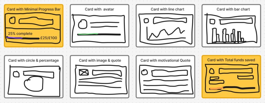
I accomplished this by using the Crazy 8s approach, a quick drawing exercise that enabled me to see beyond the apparent. I paid particular attention to the “Savings Goal Card,” a key feature in Nestfundi’s dashboard.
I came up with eight distinct design options in eight minutes, ranging from status badges and gamified styles to visually appealing graphics and simple progress indicators.
This enabled me to rapidly assess a variety of orientations and identify recurrent trends such as:
- The need for clear visual progress
- Trust signals like “Verified Goal.
Motivational text (“You’re 40% closer to your goal!”)
- Micro-actions like “Edit Goal” or “Boost Goal”
The sketches influenced how user would emotionally relate to their savings journey and served as the basis for my wireframes.
“It’s acceptable that some of the concepts didn’t work. However, one concept revealed the ultimate goal: a simple, eye-catching card that makes saving seem worthwhile by utilizing color, microcopy, and progress tracking.
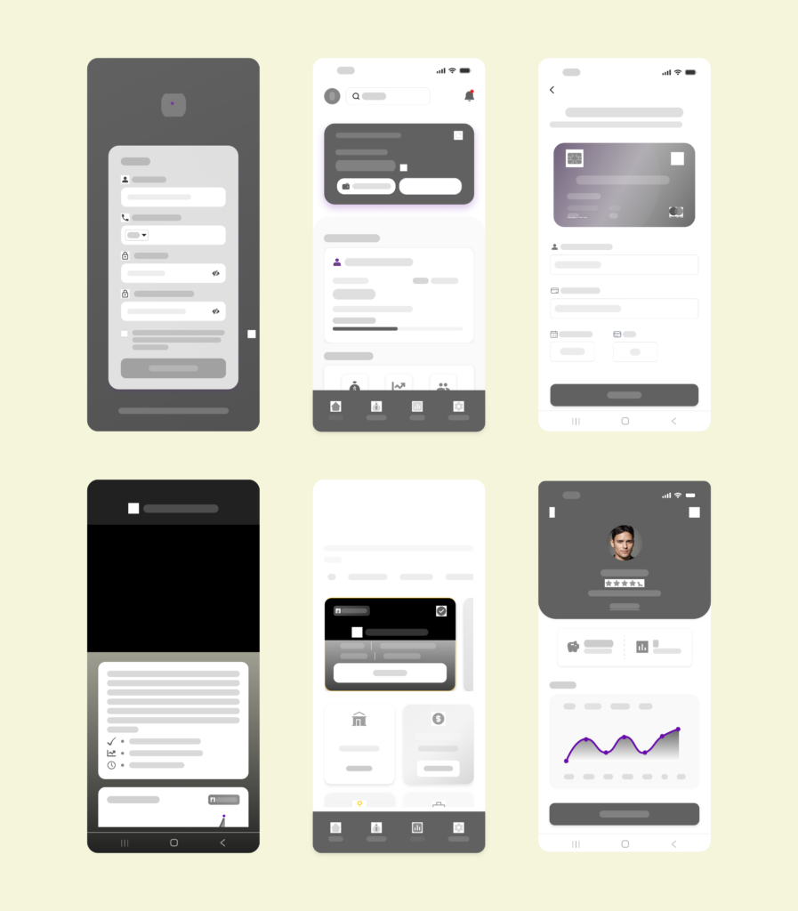
Wireframing
I translated key user flows into low-fidelity wireframes with an emphasis on clarity and usability. These comprised onboarding, dashboard, savings, and investment pages. These pages were kept grayscale to give layout and hierarchy priority before applying visuals. Wireframes helped validate structure early in the process.
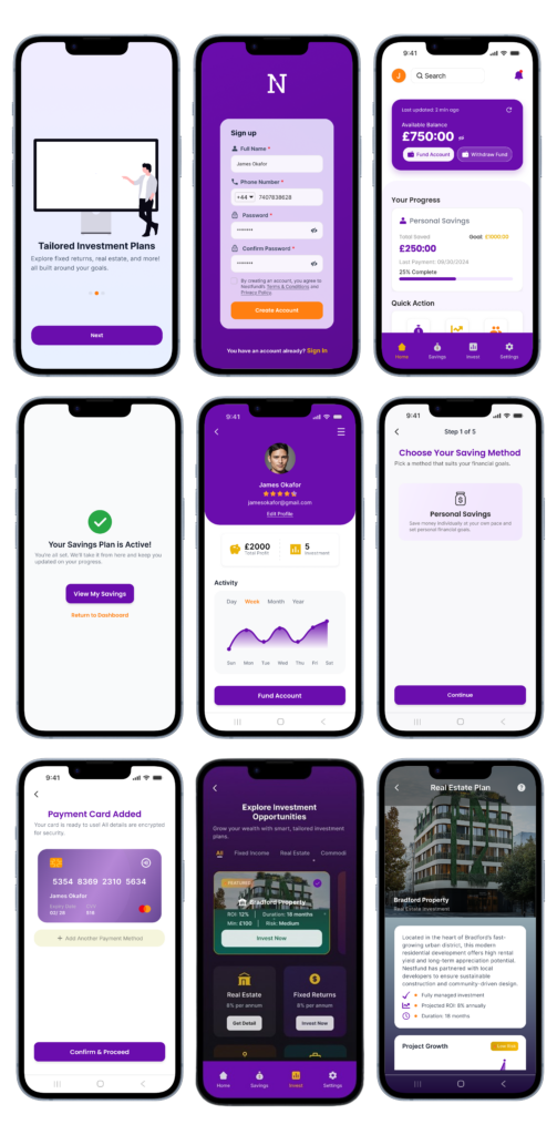
Prototyping
Bringing Usability and Visual Design Together: High Fidelity Designs
To make the user flow more dynamic, I created an interactive prototype that was quite similar to how the finished product will be used. This enabled me to test navigation, obtain feedback early, and make confident design choices prior to development.
By mimicking real interactions, I was able to find usability problems, modify screen flows, and improve user satisfaction.
Typography:
- Headings: Poppins – 700 weight, clean and confident
- Body: Inter – 400/500 for easy readability
Color:
- Background Gradients: light purple (#6A0DAD) to deep purple(#471F7D)
- CTA Buttons: Vibrant purples, Warm orange
- Card Surfaces: White with subtle shadows for contrast
Components:
- Beautiful MasterCard-style Fund Cards
- Progress Trackers for Savings
Usability Testing
To ensure Nestfundi was intuitive for first-time users, I conducted remote usability testing sessions with 5 participants. I observed as users went through important processes, including investing, saving, and onboarding. Feedback identified minor friction points, which were fixed with improved microcopy and UI changes.
Tool Used: Google Meet, Figma (interactive prototype), Notion (feedback notes)
Next Steps / Learnings
Next Steps
My next priority as Nestfundi expands is to improve user engagement by implementing features like streak awards and goal-based savings to promote consistency. In order to allow users to pool money with friends or family, I intend to include social savings groups. There are also plans to add more varied low-risk investing alternatives to the marketplace. I’ll be adding additional local financial education content and bilingual help to increase trust.
I also aim to improve the onboarding experience with tooltips and walkthroughs for first-time users. Additionally, security improvements like two-factor authentication and biometric login will be considered. Lastly, I’ll be keeping a careful eye on user input in order for me to improve the dashboard’s usability by streamlining the navigation.
Learnings
Designing Nestfundi helped me understand how to design for users from a variety of financial backgrounds, especially immigrants adapting to new systems. I discovered how crucial empathy is to product thinking-—establishing trust via transparent, human-centered experiences. I learned how little discoveries may result in significant UX enhancements through user research. I also strengthened my visual design skills, balancing functionality with modern aesthetics.
Through testing and prototyping, I was able to see the importance of rapid iterations and how feedback leads to improved results. Working with Nestfundi made me realize that inclusivity, accessibility, and simplicity are necessities rather than features. Ultimately, it was a rewarding journey from sketch to prototype, where design truly met impact.