GroupBuy
Groupbuy is a platform that facilitates group purchases, allowing users to access bulk discounts. It streamlines the experience of group purchases while improving accessibility and affordability.
Role
UI/UX Designer
Project Lead
Duration
2024
4 months
Design Process
In making this project, I went through design thinking approach for systematically identifying the user needs in order to ideate the solution that given lasting value for the users.
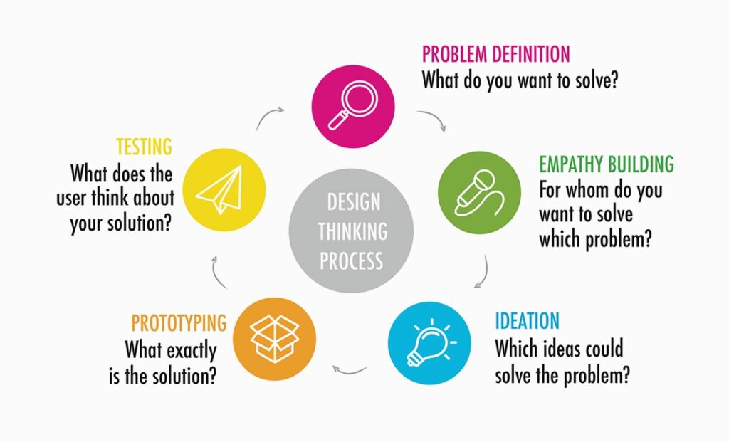
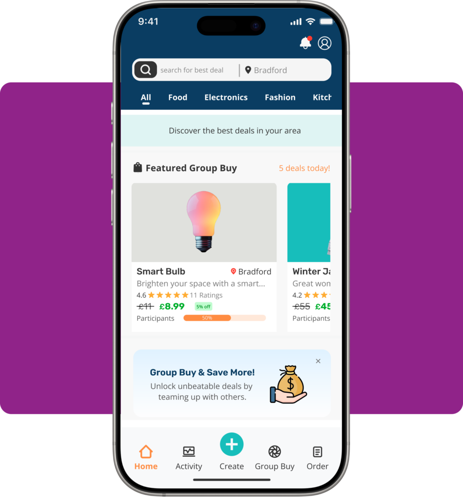
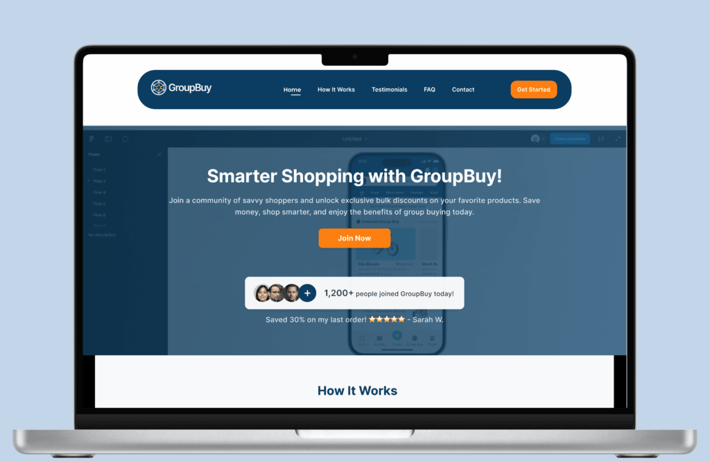
Image Source : playroom.rocks

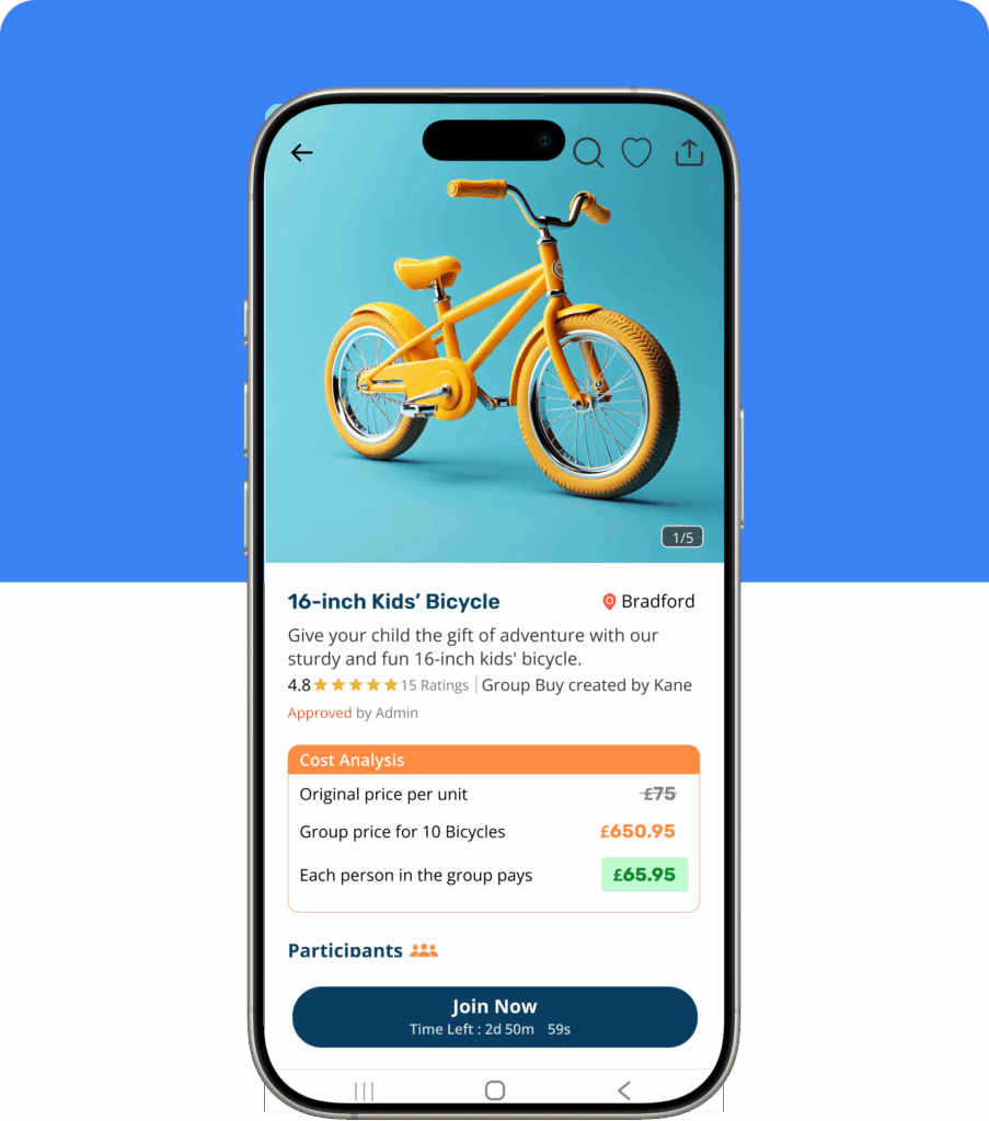
Pictured above: a quick glance of the product page for GroupBuy
01. Overview
As a UX designer, I’m always looking for chances to develop creative and approachable solutions. This project involved more than simply creating a product; it also involved resolving an issue I saw in the actual world.
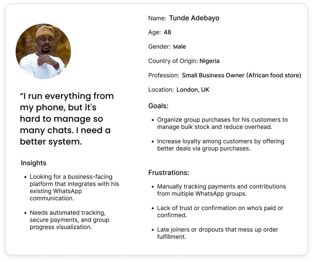
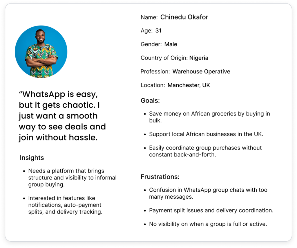
As an African living in the United Kingdom, I noticed that many Africans here rely on using WhatsApp groups to organize bulk purchases. The idea is simple and straightforward: they form a group, collect money, and buy products together to reduce costs. However, because WhatsApp was not designed for this purpose, using it leads to significant inefficiencies. They encounter the following while using it:
- Lack of structure – As no formal system to track orders.
- Trust issues – Mismanagement of funds and confusion on payment tracking. These also affect product that has potential to sell more.
- Poor coordination – Users struggle to find enough buyers to get the best discounts.
- Communication issues – Too many messages, missed updates, and difficulty managing logistics.
So, I recognized a big gap and a chance to create a platform specifically for that purpose, which I called GroupBuy. People would be able to plan, oversee, and take part in group purchasing using this platform in an organized, transparent, and user-friendly manner without worrying about financial loss or fraudulent activity.
This case study explores my end-to-end UX design journey in creating
GroupBuy Mobile App – Where users organize and join group purchases.
Admin Dashboard – For managing transactions, users, and logistics.
Landing Page – To onboard and convert new users.
02. Understanding The Problem
User Research & Insights
Since there weren’t many well-known apps for group buying, I started researching by
- Observing the way people organize bulk purchases on WhatsApp.
- Conducting interviews with prospective users to learn about their pain points.
- Examining local African marketplaces’ bulk purchasing practices in order to understand group dynamics.
Key Research Findings:
- Finding and participating in group purchases should be made simpler for users.
- People are afraid of losing their money; thus, trust is a big problem.
- It becomes difficult to keep track of who has joined and how much each person has contributed.
- It is challenging for many users to keep track of contributions and make payments.
- No clear tracking of funds or receipts, leading to disputes.
- Fear of fraud or mismanaged orders.
- The status of the group order is not visible to buyers most of the time.
- Admins find it difficult to coordinate orders and deliveries efficiently.
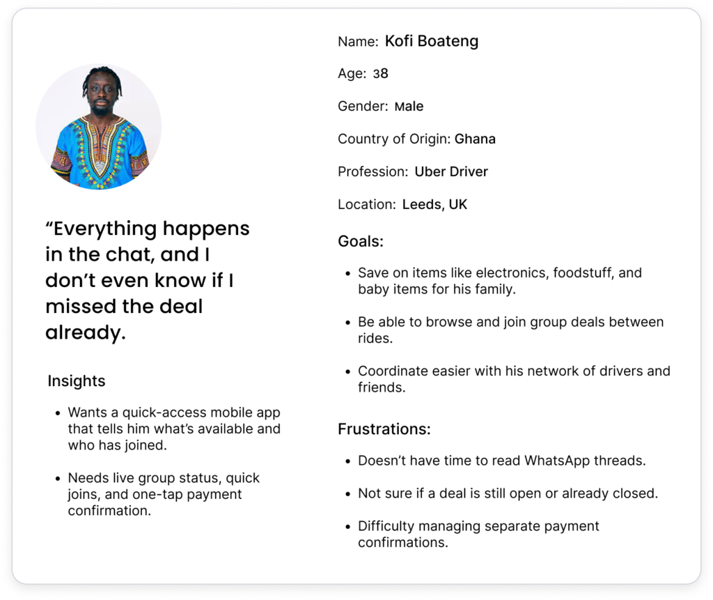
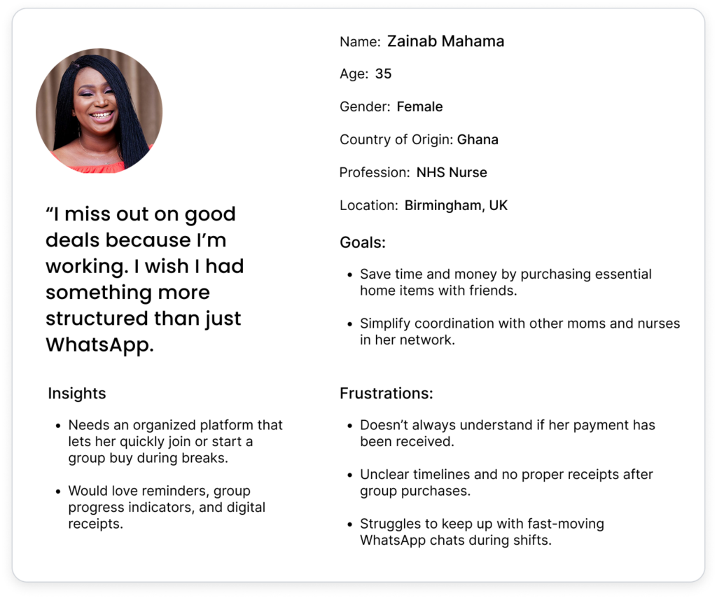
By understanding their frustrations and needs, I was able to shape the design of GroupBuy to address these pain points and create a smoother, more efficient group buying experience.
03. Define The Solution
My research helped me pinpoint the main problems I needed to address:
For Shoppers:
How can group purchasing be made safe and simple?
How do I make sure that transactions are transparent?
How can I help users find group-buying opportunities in their local area faster?
For Admins:
How might order management be made simpler?
How can I lower the risk of fraud by automating payments?
How can I make deliveries and logistics easier?
For New Users (Landing Page):
How can the advantages of GroupBuy be communicated effectively?
How do i build trust and encourage sign-ups?
With this problem definition, I moved on to ideation.
04. Ideation & Wireframing
In order to address these problems, I explored several UX approaches and ultimately selected three fundamental design principles:
Simplicity—The app should be intuitive. Users should have no difficulty while using it.
Transparency—Payments, orders, and discounts should all be easily visible to users.
Community-Driven—The platform should encourage trust and collaboration.
I sketched out my first ideas and prioritized the features according to user requirements.
Core Features Brainstormed:
Group Purchase Listings—Users can browse and join ongoing group buys.
Trust Indicators—Verified sellers and user ratings to prevent fraud.
Automated Payments—Users contribute via the app, reducing manual tracking.
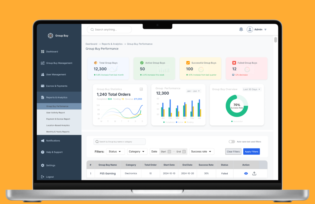
Admin Order Dashboard—A structured panel for admins to manage purchases.
Real-Time Updates & Notifications—To keep everyone informed about orders.
Landing Page Conversion Optimization—A strong CTA and social proof to drive sign-ups.
After finalizing the ideas, I moved on to wireframing.
Wireframing – Structuring the Experience
Prior to starting the UI design process, I created low-fidelity wireframes to establish the
User journey – From finding a group purchase to putting in an order.
Information hierarchy – Ensuring that important information is easily accessible.
Navigation & Layout – Making interactions smooth and intuitive.
Wireframing Approach:
For the App: I prioritized usability, making sure users could quickly find deals and track payments.
For the Admin Dashboard: I made the layout more efficient by including management features and a clear data visualization.
For the Landing Page: I structured it to communicate the platform’s benefits effectively, using strong visuals and testimonials.
Information Architecture
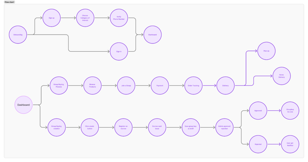
In this process, I made a site map and user flows for critical routes to aid users navigation and also to guide the usability design processes.
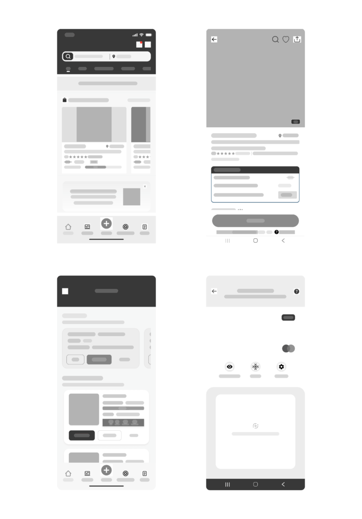
Low-Fidelity Wireframes
I created a low-fidelity wireframe for the app’s basic architecture. Usability was the main focus of the wireframes, which included obvious calls to action for crucial tasks, including creating a group and payment completion.
User Flow:
In order to create a group, invite members, and keep track of payments, I outlined the user flow. To make the flow smooth, I deliberately made sure there was no friction.
Visual Design
- To communicate simplicity and trust, I made a mood board using eye-catching colors and simple text.
- For uniformity throughout the app, I created a design framework using reusable components (buttons, icons, cards, etc.).
- The final designs have a simple, modern interface with easy-to-use navigation and a distinct visual hierarchy.
Once the wireframes were validated, I moved to Prototyping
05. Prototyping
Using Figma, I produced an interactive prototype that illustrated the main features of the application.
Interactive Prototype:
The prototype allowed users to:
- Join a group buy available in their locations successfully.
- Create a group and invite members.
- Track payments in real-time.
- Receive notifications for important updates.
Video Above: Shows the prototyping of groupbuy from onboarding, groupbuy participation, and groupbuy creation.
After Prototyping, I moved on to Usability testing.
06. Testing – Validating the Experience
I conducted both guerrilla and moderated usability testing with 10 participants.
Tasks included:
- Joining a group buy
- Creating a group and inviting members.
- Making a payment and tracking progress.
- Checking notifications for updates.
Usability Testing Results:
- Users liked the simplicity of the group creation process.
- Some users found the flow of making payment confusing.
- Notifications were highly valued but needed to be more prominent.
Iterations:
- Simplified the payment interface for easy flows.
- Made notifications more visible by adding a badge to the navigation bar.
Final Outcome & Impact
I finally developed the GroupBuy application with the following essential features after several iterations:
GroupBuy App:
- Simple group purchase organization with secure transactions.
- Automated order tracking and payment management.
- Community-driven trust system for verified sellers & reviews.
GroupBuy Admin Dashboard:
- Efficient order and user management.
- Real-time sales analytics & reports.
- Integrated logistics tracking.
GroupBuy Landing Page:
- Clear value proposition with engaging visuals.
- Strong CTA & social proof to drive sign-ups.
- Optimized UI for conversions.
Impact
Reduced confusion in group buying
increased by
80%
Improved purchase coordination
by
60%
Next Steps/Learnings
Next Steps
Future plans for GroupBuy include adding a chat feature for group communication and a rewards system that accumulates to use for creating group buys in order to reduce fraud and increase seriousness.
Learnings
Applying a Design Thinking mindset—identifying a problem space, defining an unresolved problem, coming up with solutions from scratch, and then prototyping and testing those solutions—was a fulfilling process that provided a great chance to develop as a UX researcher and designer.
As someone who would personally love using the app I designed, there were undoubtedly difficulties in coming up with solutions that represented the requirements and desires of the users without imposing my own assumptions on the project.
.